

Goal
Colonnade BridgePort set out to refresh its brand image and personality in an effort to attract new talent and compete more effectively in an evolving marketplace. From a practical standpoint however, certain elements of the brand could not be changed due to costs (including logo and property signage) so all efforts were focused on updating the look and feel of the website, of online marketing channels, and of marketing collateral.
Situational Analysis
Colonnade BridgePort is one of Eastern Canada’s largest 3rd party property management companies with 16M sq. ft. of commercial and residential properties in its portfolio.
Unfussy Recommendations
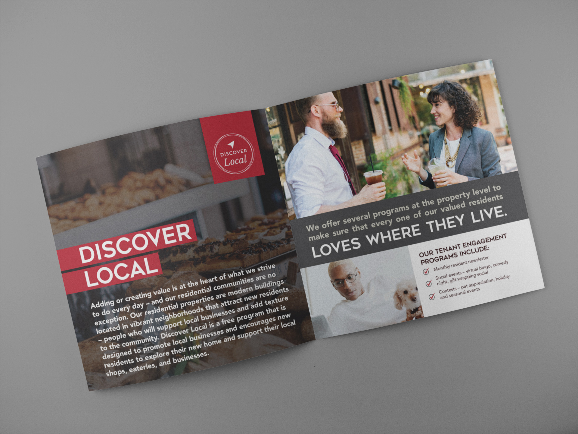
The strategy was simple: Make Colonnade BridgePort more relatable by incorporating “human” elements into the brand (ie, imagery that was once solely focused on buildings now incorporated people working and living in spaces, and language that was once technical and academic became simpler and easy to understand. The colour palette was expanded from basic red, black, and white to include warmer colours, and typography was updated and used as a design element).
Output
- Visual Identity system creation
- Internal communications development
- Targeted traditional and digital advertising and marketing communications campaign conceptual development, design, and production
- Ongoing marketing collateral design and development
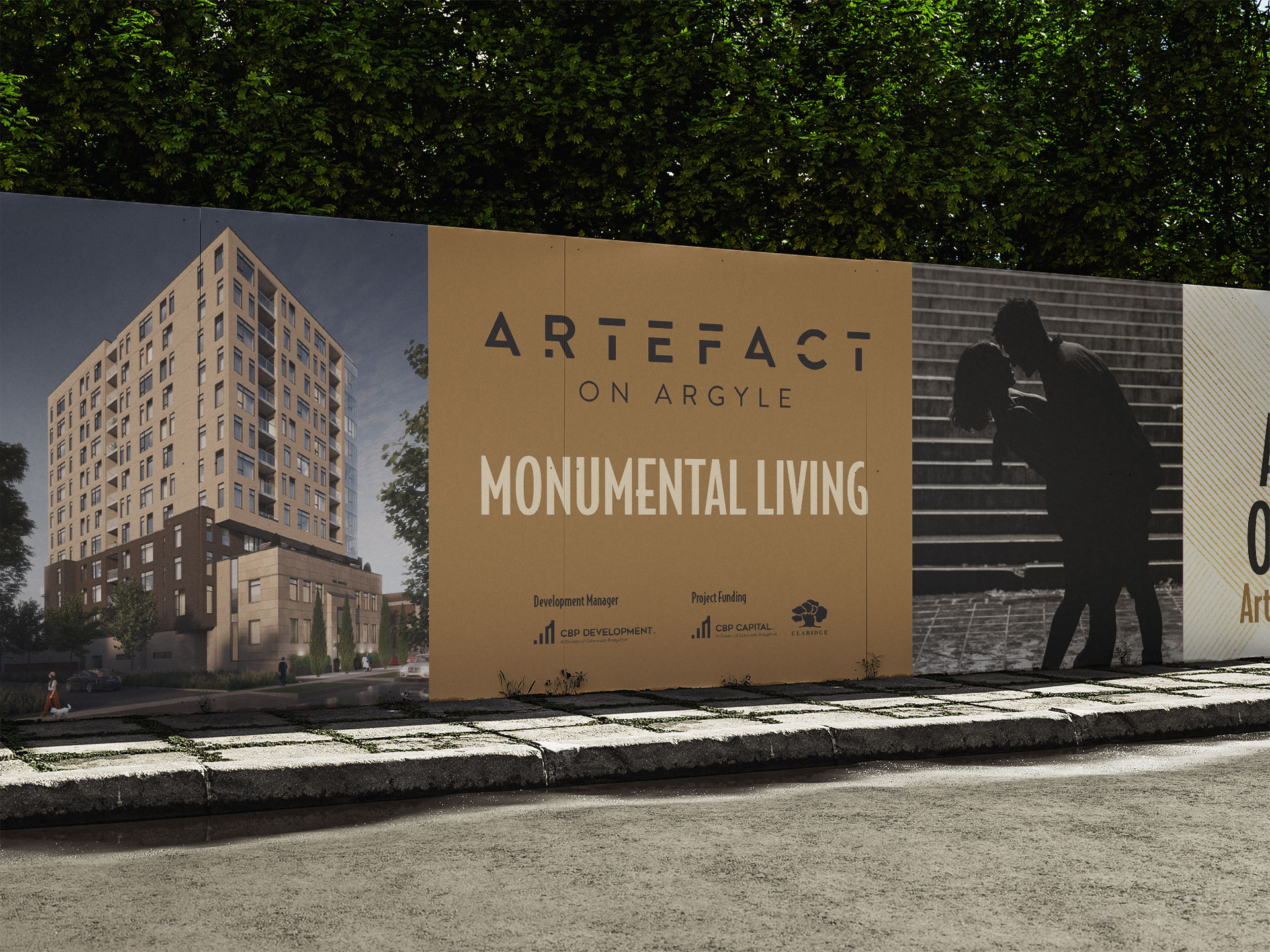
- Signage and pageantry design and production
- Brand Standards (Playbook) / visual identity guidelines development
- Website design and development


Outcomes
The Colonnade BridgePort brand expression continues to evolve as new tools and materials are developed to support its growth in Ottawa and the GTA.
Testimonial
“Their consistency, attention to detail, and thoughtfulness are great.”
Catherine Proulx
Director of Marketing, Colonnade Bridgeport