

Goal
As the nation’s only Spondyloarthritic (SpA)-dedicated organization, the Canadian Spondyloarthritis Association (CSA) required visual identity and brand awareness marketing campaign assistance to raise awareness of the disease among not just the public at large (for support) but within the medical community (for effective, timely diagnosis).
Situational Analysis
Given the overwhelming evidence that many people suffering from Spondyloarthritic diseases feel lost and alone both pre and post-diagnosis, it may be safely said that access to physical, mental and emotional support, exposure to critical resources, and relentless advocacy must be prioritized throughout the entire lifecycle of the patient journey.
In an effort to build and keep interest, intimacy and loyalty. Unfussy worked to develop, define, and communicate the CSA’s brand values and promise through the creation of a strategic brand direction, brand story and messaging platform, a new bilingual visual identity system, and a bold brand awareness national advertising campaign.
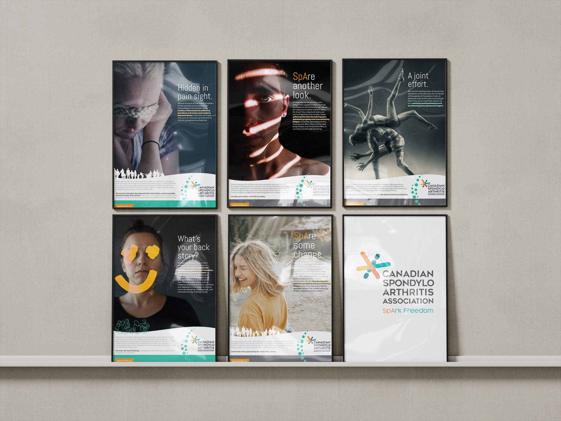
Unfussy Recommendations
Through extensive internal workshopping and external research, Unfussy determined that the Canadian Spondyloarthritis Association MUST be positioned as a caring and supportive community; as a centre of clarity and information; as a relentless watchdog for SpA advocacy in the prioritization of awareness, education, and support; and as a true catalyst for meaningful action and lasting change to claim the mantle of legitimacy and leadership.
The CSA must be seen as THE destination and resource tool for all audiences impacted by SpA, and must first work to CONNECT with audiences (raising and promoting CSA brand awareness in order to gain recognition and respect as THE community through which all audiences may receive education and support) in order to DIRECT said audiences through targeted marketing and advertising campaign initiatives encouraging specific action items…be it health care professionals giving their care, the public or private sectors giving their time or monetary donations, or simply general Canadian audiences giving their attention.
By positioning itself as a professional and progressive, proud, and resilient community through the effective implementation of powerful educational resources, the CSA will prove to display strong leadership while fostering social cohesion and true change in the minds and hearts of those suffering from SpA.
Output
- Strategic Direction and Organizational ReBrand development
- Internal and external communications strategies
- Messaging Platform development
- Visual Identity (logo) system creation (bilingual)
- Targeted national advertising and marketing communications campaign conceptual development, design, and production
- Brand Standards (Playbook) / visual identity guidelines development
The rebrand initiative was fed by extensive internal and external research, including key stakeholder / BOD workshops, SWOT, and discovery sessions, and online surveys.

Outcomes
Like a guiding beacon of hope, the CSA is positioned to encourage constant activity, discussion, learning, and sharing through various audience points of contact. It is now well on its way to becoming a single destination for all education, information and knowledge in answer to the questions of what to expect, why, and what to do next.
The CSA is now sure to SpArk Hope, SpArk Movement, and come to be known for safety and inclusiveness, community empowerment and companionship, comfort, compassion, the reassurance of human connection without fear or judgement, and everlasting hope for a more promising future.